SAVR
SAVR
INTRODUCTION
Savr is a recipe app that wants to make it easier for people to follow new recipes, and cook great meals at home. However, many people who are excited about a certain recipe end up frustrated with the process and disappointed with the outcome. As a designer, I was tasked to find a solution to this problem. To do so, I followed a modified GV Design Sprint.
I analyzed user interviews and feedback to come up with a solution, which I later prototyped and tested. The solution was for users to have the opportunity to review the recipe’s ingredients, equipment, and prep work before starting the cooking process. In the following case study, I’ll be demonstrating how I came up with this solution while following a modified GV design sprint. This sprint is divided in 5 days: Map, Sketch, Decide, Prototype, and Test.
Tools
Figma
Miro
Roles
UX Designer
UI Designer
Information Architecture
Duration
One week
MAP
On the first day, I familiarized myself with the problem, read through research, and mapped out Savr’s most important user flow (based on the problem).
The first step was to define the business and user goals to better understand the problem keeping them from reaching those goals.
Business Goals:
Savr wants to make it easier for people to follow new recipes, and cook great meals at home.
User Goals:
To follow a recipe easily and confidently, so the dish comes out as expected.
For new recipes to be enjoyable and challenging, not stressful and chaotic.
With those goals in mind, I read through user feedback and watched user interviews. Based on the notes I took, I was able to define the problem and figured out what were some of the elements that were keeping the business and user goals from converging.
Problem Statement:
Many people who were excited about a certain recipe ended up frustrated with the process and disappointed with the outcome.
What is getting in the way of the user and business goals?
Being unfamiliar with ingredients and how to prepare them.
Having to do surprise prep/cutting/steps once you’re already cooking.
Needing to rush to prepare things in the middle of cooking
Not knowing if they’re on the right track halfway through the dish.
Wasting time/making mistakes due to not being clear on what is next.
Once I felt like I truly understood the problem, I was able to start thinking of a solution! The first thing I did was create a few different maps of possible end-to-end experiences and picked the one I found to be the best and decided on a solution statement to guide my ideation. Below is the end-to-end experience map I chose:
End-to-end experience map
I chose this map because a lot of the pain points expressed by the users could be solved by simply knowing certain things beforehand, such as what and when to prep certain ingredients, what kitchenware is required or recommended for the dish, as well as techniques that are included in the recipe. This way, users can fully understand the recipe before they start cooking, which should alleviate the stress they feel when trying new recipes, as well as result in dishes that come out as expected. No surprises!
Solution Statement:
Users have the opportunity to review the recipe’s ingredients, equipment, techniques, and prep work before starting the cooking process.
SKETCH
The second day of the sprint was all about ideating possible solutions. I did this by first completing a modified lightning demo, doing a crazy 8’s exercise, and creating a solution sketch.
Lightning Demo:
Since lightning demos are usually done as a team, I completed a modified, one person lightning demo. I did this by looking at solutions competitors have produced to solve a problem similar to the one you are trying to solve. I picked Tasty, Allrecipes, and Epicurious, and drew inspiration from some of the solutions I saw in their products.
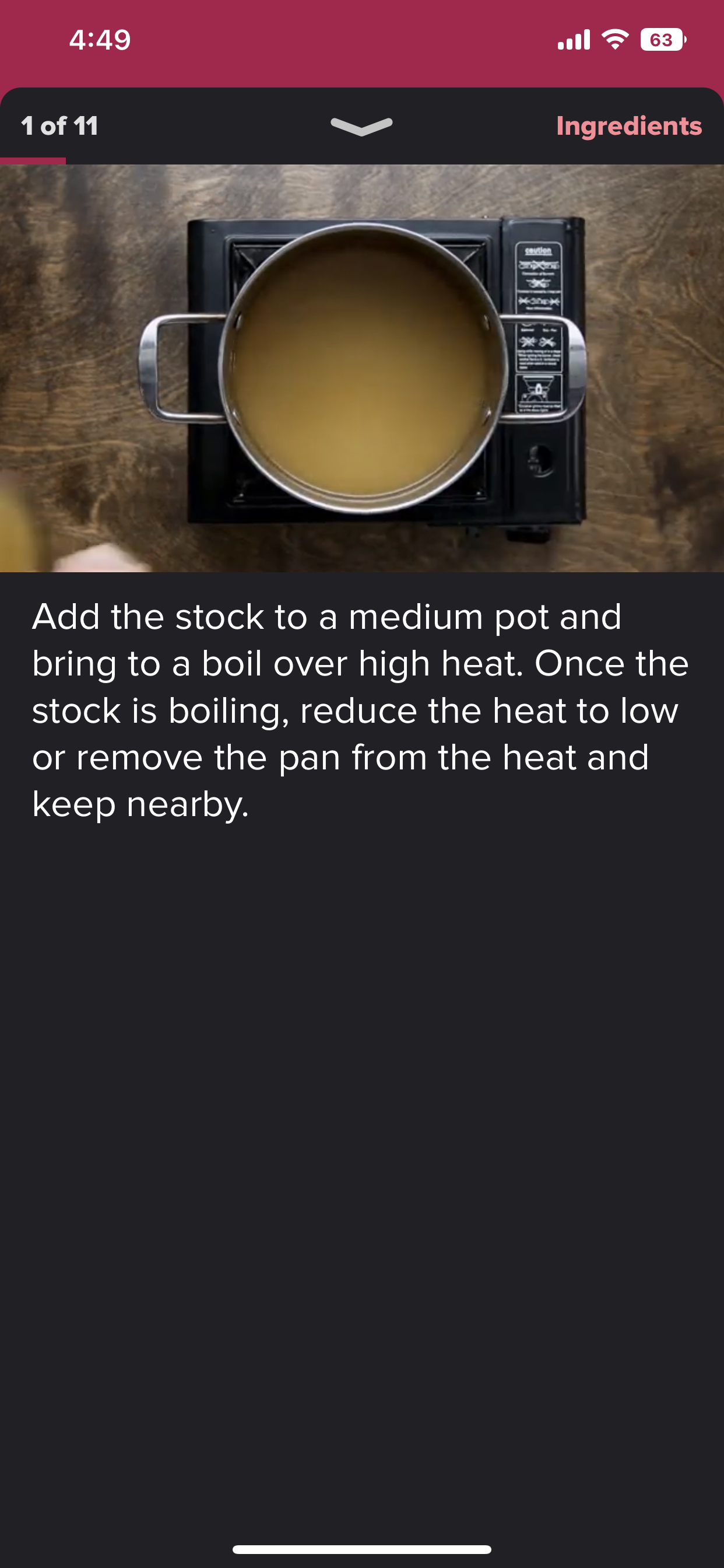
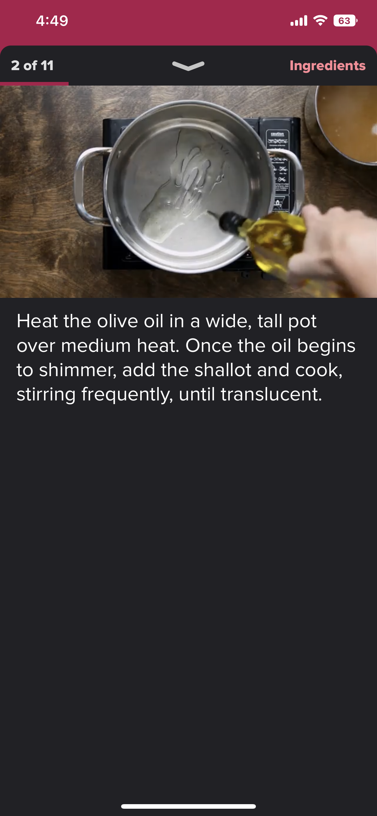
Tasty
Their step by step mode allows users to have images of the different steps of the recipe, as well as give instructions in an easy to follow way.
The videos they provided also help users know if they are on the right track and demonstrate the process.
Tasty Recipe Example
Allrecipes
They provide a video of the dish being prepared.
They also provide close up visual representation of the steps.
Allrecipes Recipe Example
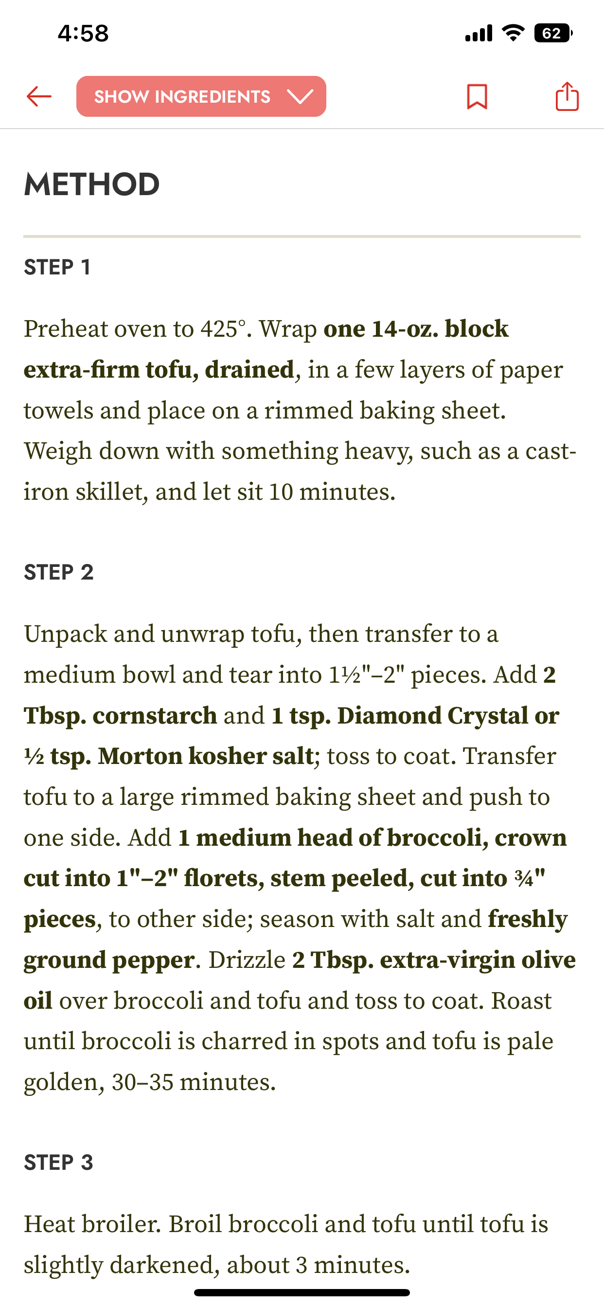
Epicurious
Epicurious did not have a solution to take inspiration from or consider. They have very detailed instructions that are text heavy with no images or prior instructions to make the recipe easier to follow.
Epicurious Recipe Example
Crazy 8’s:
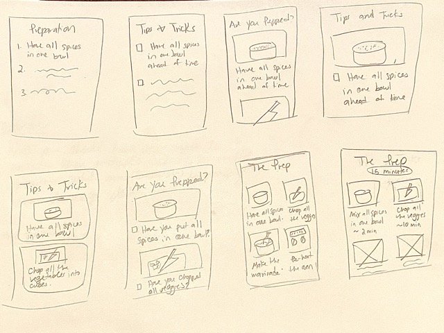
After I did the lightning demo, I sketched out a critical screen using the crazy 8’s method, which consists of eight quick sketches of the same screen in eight minutes. After each drawing, I explored more alternatives, and improved upon already drawn ideas until I was left with a viable solution. Because the solution statement focuses on the user being prepared before starting to cook, I chose a screen where users can review the prep work before cooking.
Crazy 8’s Sketches
Solution Sketch:
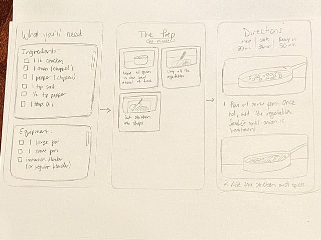
The crazy 8’s exercise was very productive! It gave me the chance to quickly ideate and compare ideas quickly. Each sketch I either tried something new or added something until I was left with a good idea of what the screen could look like. After completing the exercise, I made a solution sketch with the screens that would be added to the Savr app to solve the problem.
Solution Sketch
How do these screens solve the problem?
The problem is that many people who were excited about a certain recipe ended up frustrated with the process and disappointed with the outcome
.Some of their pain points were:
Having to do surprise cutting, prep work, or steps while already cooking.
Not knowing if they are on the right track, and wasting time or making mistakes due to not being clear on what is next.
The solution statement I had come up with to guide my ideation was: Users have the opportunity to review the recipe’s ingredients, equipment, techniques, and prep work before starting the cooking process. This would avoid all of the frustrating cooking and prep work in the middle of the recipe, while helping avoid mistakes down the line.
In the solution sketch, I added three screens:
The first screen has a checklist of the ingredients and equipment, so users have everything they need at hand instead of looking for ingredients while already cooking. This also helps users know if they have the ingredients and equipment needed to complete the recipe to begin with.
In the second screen, there is a breakdown of the prep work needed for the recipe. This will allow the user to know what needs to be prepared prior to cooking to avoid frustrating prep work in the middle of cooking that could ruin both the experience of making the recipe, as well as the dish.
On the third screen, the users follow the recipe in concise steps, with each step having an image to demonstrate to the user what the dish should look like at different steps of the process.
DECIDE
Storyboard:
On the third day of the design sprint, I created a 5 panel storyboard. I used my solution sketch as the basis for the storyboard, and added a few screens to reflect what the experience of the solution will be like.
The 5-panel Storyboard
The storyboard consists of:
The homepage: Where users will find the recipe they want to make.
The recipe page: Where the users will have the option to follow the guided recipe experience.
The “What you’ll need” page: Where users can make sure they have all of the ingredients and equipment needed for the recipe.
The “prep” page: Where users can review the necessary prep work for the recipe, and have everything ready before cooking.
The directions: Where users can follow the directions and complete the recipe.
PROTOTYPE
On the fourth day of the Design Sprint, I used the storyboard I sketched the day before to create a prototype to test my solution.
Because this was all made during a Design Sprint, I made a quick prototype to use for testing the solution with the users. Even though the prototype was made to be quick and simple, I added the brand colors and the font to give it the feel of the real app. I also added pictures to make it more realistic for the users and for the results to be as accurate as possible.
Click here to access the prototype.
Prototype
TEST
On the fifth and final day of the Design Sprint, I tested the prototype on 5 different users by following The Five Act Interview model. The tests were all performed in person and all on the same day. All five users who were interviewed were people who cook frequently and use online recipes when making something new.
I spent the first few minutes building a rapport by asking questions about their interests as well as their cooking habits.
Next, I encouraged the users to think out loud and give their honest feedback as they completed three tasks on the prototype.
After completing the tasks, I spent some time debriefing with the users and asking follow up questions.
Results:
Thanks to the usability tests and feedback, I found a couple of usability issues, such as lack of clarity with the now “I’m Ready to Cook” button, which originally said “Begin”. All users were able to complete the tasks, and had positive feedback about the solution, with one user saying “I had a good idea of what cooking the recipe would be like without even doing any cooking.”
I found a lot of success following the Five Act Interview model, as I found the users I tested seemed very relaxed and open to sharing their honest feedback. I feel like the Five Act Interview model helped alleviate the pressure interviewees tend to put on themselves to “give the right answer”. I will definitely continue utilizing this model in the future.
REFLECTION
When using the Savr app, many users who were excited to try a new recipe ended up frustrated with the process and disappointed with the outcome. As a designer, I was tasked to solve this problem using a modified GV Design Sprint. To solve this problem, I designed a user flow where users have the opportunity to review the recipe’s ingredients, equipment, and prep work before starting the cooking process. At the end of the fifth day of the Design Sprint, after completing some usability testing, I was able to conclude that the user flow I designed solved the problem for the user.
Solving this problem while following a modified GV Design Sprint model taught me ways to quickly come up with solutions without sacrificing important steps in Design Thinking - It showed me that one can come up with valuable and effective solutions in an exciting and fast paced way. I truly believe that experiencing a Design Sprint has made me a better designer.


